Wednesday 7 March 2012

Evaluation:Question 4

How did you use media technologies in the construction and research, planning and evaluation stages?


Research

We have used quite a lot of technology this year in media in preperation for this we did some practice with cameras, lip syncing and we made a short music video, however this was a controlled process, using Adobe Premiere Pro gave us some knowledge of the technology we were going to use.

 I used media 2.0 in the form of facebook and youtube, we used facebook in order to keep contact with our artist, this is also how we found our dancer. Using yahoo email she sent us a recording of her dancing so that we could decide if we wanted to include her. Facebook also allowed us to get feedback on our work. Social networking sites allowed us to have access to a wide audience and to create groups specifically for our media. Youtube is where we watched similar music videos and where we uploaded our own so that other people could watch it. The internet was my main source for my research in my blog, it gave me access to a wide range of materials that helped me when looking at my genre and other artists. We downloaded the song from Soundcloud which is where the artist uploads all his music this was easy to do and did not take very long. Soundcloud can be accessed by anyone and we found it through google.


In my blog i have used media such as prezi.com which i used to display my work in a different way. I also used slide share, this gave me the ability to upload my powerpoints onto my blog which was another way of displaying my research. These sights allow me to learn more about media and different, more interesting ways of displaying it.

Planning

I used a canon digital camera to photograph my artist for the digipak, as I am a photography student I already know how this works so I was in control. I used an auto focus setting so that the pictures were in focus and not blurry. I instructed the artist on how to sit,stand and pose as i had previously planned my digipak so i knew what i was capturing. Planning this allowed me to be very time efficeint and did not take very long, this meant i had enough time to edit my photos and create my promotional package.

In Photoshop i already have a few years of experience i decided i was going to layer photographs and change the opacity to have a movement effect. I opened the photos i planned to use and changed them all to black and white. From here i layered one on top of the other and changed their opacity to hard light. Then i changed the amount of opacity on each layer that was on top so that you could see the effect of movement. On top i added another effect of glowing edges to make it stand out more and give an added effect. I did the same on the back cover using pictures of the artist raising their arms. I added text on Photoshop and added my bar code by making one on the internet and adding it onto my digipak. The advertisement was made by increasing the saturation on the colour, in the shoot i took a series of photos of the artist turning slightly. By layering these photographs it gave an effect of him turning round. Layering and changing opacity levels allowed me to show this and this was the image i used on my advert.


Production

We have used Panasonic HD DV cameras, in order to know how to work this we did look at the instruction manual. This helped us when filming outdoors. And gave us more information on how to use the camera we did this to avoid any disruptions when we were out filming. It helped us to be more knowledgeable and efficient if something went wrong with the camera in the filming process.

On Amy's iphone we used the ipod to play the track to the artists and the dancer so that they could perform their parts, specifically we used the play and rewind buttons which was very simple as we have both used this device before. Doing this helped to be more convenient when filming the music video. The iphone also allowed us to keep in contact with the artist as it gave us access to facebook and other social devices.


Media on the computer that we have used includes Adobe Premiere Pro, based on the fact I did Media AS I have already learnt the basics of using Premiere, adding the effects was something we had to work out and our previous lip sync activity taught me how to do this aspect. To add the black and white effect we went on video effects, image control and then using the cursor we dragged the effect over the clip we wanted it on, we had to do this for every clip and then render the timeline in order for it to play. We did have some problems in the process, we had times when the video froze and the sound stopped however when we exported the video these problems didn't return. Unfortunately it just made the editing a bit more difficult.


Friday 2 March 2012

Evaluation: Question 2

How effective is the combination of your main product and ancillary texts?

When preparing to make my music video for 'not concerned' I created a digipak and advert to advertise the artist and the song that he was due to release. I did various research tasks into the genre and similar artists to see what is usually done. From there I developed my own of what i thought would advertise my artist the best.

My music video is coherent and has a house style which mainly consists of black and white, this was a theme that ran through, we used black and white colours in our video and I also used black and white on my digipak which was however darker on my digipak compared to our music video, this is because we didn't want the music video to be too dark as it wouldn't work with the artist.. I did this as it gave a very urban, street feel which is an element that we wanted to capture. Having the theme running through means that it can all be a package.

I created a house style in my promotional package by using the same font, the font i used was 'Stencil STD' I used this font because it was bold and stood out on the dark background, after trying out multiple fonts this was the font i felt fitted with my genre the best. The effects I used were an overlay of images to make it look like a movement, on top of that was glowing edges to make the images stand out more. In the video there are 3 clips where there are different angles of the artist, this is similar for what the artist had to do when i shot the photos for the promotional package. The colours on my promotional package were a white font, a black and white colour for the main images and the inside cover had a grey colour as I reduced the opacity of the overlay. The mise en scene was specific for example the artist was instructed to wear a hoodie and his positions were also directed by us.
Stencil STD font that I used in my digipak


The grey colour that is on the inside panel of my digipak has the CMYK code of :
C= 67%
M=60%
Y=59%
K=42%

The black colour used throughout has a CMYK code of:
C=75%
M=68%
Y=67%
K=90%

The white colour also used throughout has a CMYK code of:
C=0%
M=0%
Y=0%
K=0%


Our video contains a shot of the artist with his back to the camera with his hood up, this links to the back cover of my digipak as it was a shot that was featured, this can help the audience relate the video to my digipak.

The use of the bridge in our music links to my advertisement which features a bridge. My digipak has links to the music video throughout. This makes it seem more like a package and fits everything together.


Although my video does not really look like my digipak, this is because i have a glowing edges effect on my digipak which is what gave the white edges. I did this to make the digipak more interesting and so that the moving effect showed better. This effect would not have worked on my video. The main way that my digipak links to my video is through mise en scene such as locations that we used and the outfit that the artist wore. Hopefully the audience will be able to link this and see it as a whole promotional package.


We used naturalistic lighting throughout, this is because we wanted it to be fairly redundant and as we were shooting in open spaces it looked better and more natural. We wanted the artist to fit in with the surroundings if we had used artificial lighting it would not have worked as well. The end shot on our video is lighter than the rest we did this by setting the brightness on the camera higher because we liked the effect that it gave. Using naturalistic lighting on my digipak was not a major decision because I had planned to use black and white effects anyway so light wasn't as important.

I asked a male and a female from our target audience what they thought of the music video and the promotional package as a whole? Whether they thought it fit with the genre? and whether they thought it was aimed at their target audience?

Female
I like the promotional package as a whole, I think the fact that the video and the album cover are both black and white makes them look like a whole package. I especially like the effect of movement on the album cover. The use of the hoody on the video, album and advert links them all together and show they belong together even though the album is slightly darker. I think it is aimed at the teenager, young adult age but in my opinion it does suit males more than females.
Charlotte Morgan, 18

Male
I like rap music and i did like the video, i like the fact that it looks like the 99 problems video and i like the speed of the video. As a whole package i think it fits together well. The same writing is used throughout and the same colours. Adding a little more colour to the advert i think was a good thing as it attracts more attention. I like the use of the hoody to help link it all together. I can tell the genre from looking at the album, this helped me identify the genre to begin with. I think it suits the target audience of young adult.
Michael Clarke ,17

Overall I think that I have created a promotional package that is coherent and has a constant house style throughout. My target audience could tell who the desired target audience was although some feedback told me it was aimed more toward males. Although I believe my constant style throughout and the elements that linked it all together can be seen and are aimed towards my target audience. However some people may have trouble linking it as i have not used the exact same effects. Also some people may think that the digipak is too dark, i took this into considerationhowever i liked the effect and decided to keep it.

Wednesday 29 February 2012

Evaluation: Question 3

What have you learned from your audience feedback?

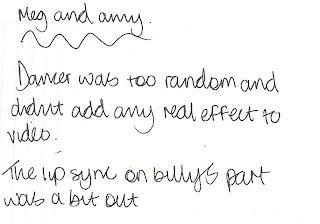
In order to get some audience feedback we allowed a group of students who also made music videos to watch our video and then on paper they wrote what they thought of our video. From this we analyzed the positive and negative points. Some of the audience said that they did'nt understand the dancer and they would like her to eb more established. We could do this by adding more dancer shots or by getting the artist to dance. Some commented on the fact that there is a small part of the lip sync which is out, we are aware of this and it is a small problem that could be fixed in very little time. They think that the genre is shown well and we have coherent themes. The audience liked the performer, they felt his performance was believable and they also liked the pace of editing. The black and white effect worked well but some of the scenery was a bit out. Although we do not agree with this comment as we used locations that fit in with the genre and some of our locations were used repeatedly so that we were not just using random locations and it had a theme running through. We would like to add more of the female vocalist into the video though which has been suggested in the feedback. Below is the feedback that we received:


When we initially uploaded our video onto facebook we allowed people to comment so that we could get some audience feedback. I have printscreened the feedback we got. From our facebook feedback people said that they liked the black and white effect that was used as they felt it made the video looked better and added to the overall performance. They also liked the creditability of the performer. They agreed that the lip sync was done very well although we are aware that there are some small parts not totally in sync. One girl said that she thinks that the female isn't as strong as the other performers which is something we can improve on although the main performer overall is the male performer. The audience liked the surroundings and the details as they felt it fitted with the song, this is something that we wanted to get right as the mise en scene was a very important aspect to the genre and the song.


Friday 24 February 2012

Evaluation: Question 1

In what ways does your media product use, develop or challenge forms and conventions of real media products?

The ideas for our media came from looking at the work of other artists in our genre, in the research stage we looked at artists such as 50 cent and Cher Lloyd to look at how the genre of rap and hip hop can be conveyed to the audience so that they can distinguish the genre also.


We liked the 99 problems video by jay z we felt that it captured the mood of the song, we most liked the black and white effect used, we decided to use this in our video as we felt it was quite urban and gave our video a street effect which was what we wanted the audience to experience. Also we used a range of pan shots which is similar to the 99 problems video, we did this to distinguish the surroundings, we can see from the pan establishing shots that the location is very street which fits in with the genre of the video. From this video we too the idea of the black and white colour because it gave the video a bit of an edge. The black and white effect made the video look more high end in my own opinion.

Our video has fast paced editing, this is done to fit in with the pace of the song. As it is the rap genre the song has a fast pace. If the pace was slow it would not fit in with the genre. I like the fast pace editing but from our audience feedback we have been told that the pace of editing could be faster.


When filming we used various cinematography such as different camera angles, we used mainly a range of close ups and mid shots as they are shots usually used in rap videos, we noticed this from our research work. We did use establishing shots and close ups of objects in the surroundings to show the audience where the location was, we tried to use objects that could relate to our genre.


Our mise en scene was very important to our genre as it was what the audience could see and this kept them interested. If the mise en scene and the music did not match then it would not be effective in showing the audience what the genre is. We used locations such as alleyways and bridges. We used costume such as a us hoodie and jeans. This also allows the target audience to relate to our artist and music. 


Our audience research made us question our original plans, we originally wanted a rather simple video , we would focus on the mise-en-scene in order to establish our genre. When we pitched our idea to a group of students we had some negative feedback. The audience thought it might be too generic and could end up being boring as similar things have been done before in music videos.


In the rap and hip hop genre in order to convey the genre to the audience you have to use elements that are stereotypical as that gives away the mood of the video. Our video turned out to be quite redundant as it was similar to videos that had been done before but we felt we added something more with the female vocalist and the dancer. This could be one of the things that would change the audiences initial ideas about our video.


During our creativity week we made a word relation poster, this helped us get ideas for our video based on our genre by giving us words that you would usually associate with our genre this gave us more ideas as to things we would use in our video in order to make the video match its genre.

In my own opinion I think that our music video is quite similar to a 'real' media product, as we based our video on the 99 problems video this gave us something real to base our ideas around. The surroundings fit in with the genre so we did not require any indoor areas. Although I think if we were given a budget then we could have made the video seem more real by using new technology and adding better effects. The whole genre of rap and hip hop is very urban and original so that is what we wanted to capture in our music video.

Our video is not very original I would say it is fairly redundant, we did this so that the audience could distinguish what the genre was. Rap and hip hop is shown in different ways, based on our artist and the song 'not concerned' we opted for an urban, street video. The artist fits in with the surroundings and it allows the audience to relate to the artist which is something we were hoping to do in order to reach our target market.

Fouad Dehghan-Mongabadi

In our video we have lip sync and a fast pace of editing which fits in with the song, this is typical of music videos but is a requirement in order to distinguish it as a music video. This what makes it clear to the audience that it is a music video. The camera movements look at the artist in different angles this makes the audience get to know the character and also keeps their attention focused on the video. If the angle never moved it would not look like a music video and would in fact be very boring for them to watch.

The denotation in the music video is a young man who is rapping wearing stereotypical outfits for a rapper, the connotation is much deeper, it is a man who is communicating with people. He is sharing his views and opinions via rap, we wanted to get the feeling of not concerned so that it related to the song. Through his attitude and behavior this is shown.

According to Raymond Williams theory of ideology i think that the audience would have emergent ideology about a young man rapping. They would think that he was a trouble maker, lazy, and not really got an opinion. In our music video we are challenging this view, the rap is giving him a voice to say what he thinks and he is passionate about it. Although the locations used are stereotypical of a usual hangout for a young teen. For example the alleyway.


The candy shop video was illustrative according to Andrew Goodwins theory as the video told a story and the lyrics matched up to some of the images shown in the video.

According to Andrew Goodwins theory music videos are either illustrative, amplifying or disjunctive. I would say our music video is quite disjunctive as the images shown do not really relate to our video and the meaning is ignored. There is one scene in the video where he talks about changing clothes and the shot changes so he is wearing a different outfit.